| Period| | 2021.03.04 - 2021.04.03 |
|---|---|
| Operating hours| | 11:00 ~ 18:00 |
| Space| | Lee Eugean Gallery |
| Address| | 17, Apgujeong-ro 77-gil, Gangnam-gu, Seoul, Republic of Korea |
| Closed| | Sundays, public holidays |
| Price| | Free |
| Phone| | 02-542-4964 |
| Web site| | 홈페이지 바로가기 |
| Artist| |
전병구
|
정보수정요청


|
|
Exhibition Information

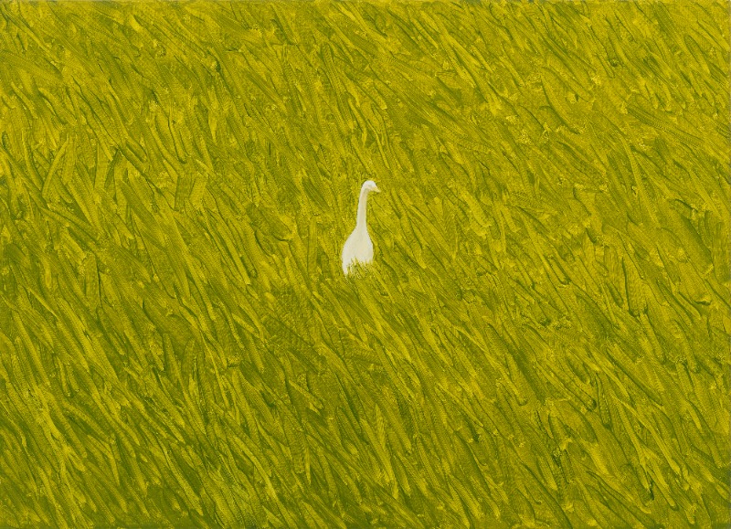
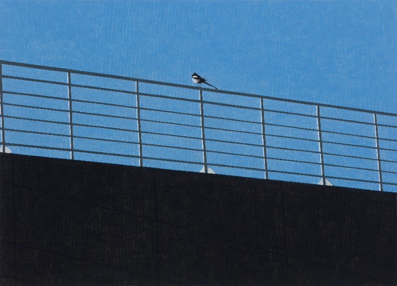
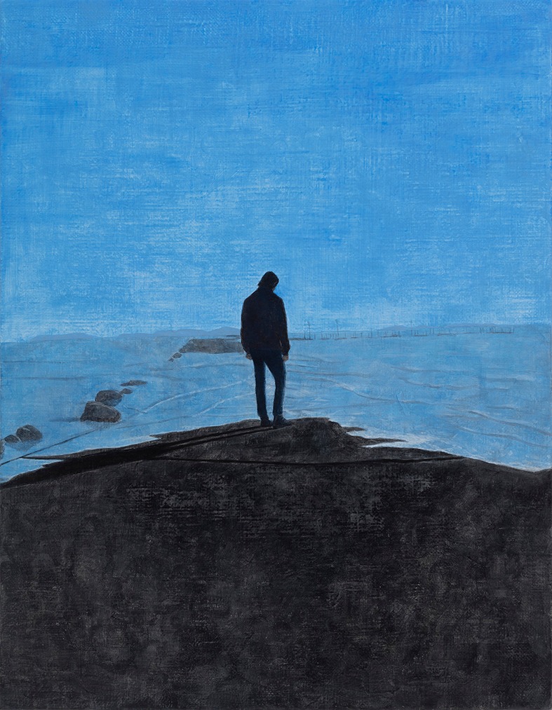
			When The Tide Comes In

Sunghui Lee


Byungkoo Jeon’s paintings start from the scenes or objects he encounters in ordinary daily life. He says that he comes to notice subtle differences when he repeatedly looks at the surrounding places that are not special, such as the roads he passes by every day, the hill at the back of his house, and the areas around the neighborhood stream. Such an awareness is something like a sense of déjà vu that suddenly comes over beyond reality, or it is also the strangeness that one feels when the familiar surroundings one encounters every day suddenly becomes unfamiliar.


The artist says that he wanted to capture things that seem near but are in fact far away, a world far beyond reality, and a silent world of pictures. This may point to the place where his work is now headed, but at the same time, it sounds like the artist’s confession of the fate of a painter, which is bound to be obscure and incomplete as one tries to define the art of painting.


This article aims to look at the characteristics and phenomena that have been sustained in Byungkoo Jeon’s work for the past five to six years, as well as the new signs observed in his recent work, and look towards the direction that his painting is headed for.


Beginning of Images


I saw Byungkoo Jeon's work for the first time at 《The 3rd Project Show》 (Project Space SARUBIA, 2015).The small size of the canvas was impressive, and I remember that I felt like watching still cuts from a short film because of the empty feelings of the paintings. At that time, he was looking for his subject matters from images that impressed him in movies or on the Internet, or from the snapshots he took himself.


He said that the images that he collects in an intuitive and random manner are selected according to momentary feelings or visual interest. The collected images are close to the fragments of everyday life for him, but by adjusting the size of the canvas, the density of paints, brush strokes, and colors, they are reborn as images with a unique air on the canvas, thereby he intended to create a distance from the quotidian life.


Byungkoo Jeon named his work around this time “selected landscape”, emphasizing the ‘selection’ of images. This selection is not only the primary selection of the original images, but also leads to the decision on how to interpret and reflect the original images on the canvas. This selection leads to the sentiment of the painted image. His works are based on photographs, but omit a lot of detailed information contained in the photographs; rather they would contain certain sentiments that seized him the moment he chose the images.


However, these sentiments, which may well be called ‘sentimental’, become more intense when viewed alongside the work titles as well as the images. For example, One Fine Spring Day (2015), which is based on a movie scene, is only a common scene we encounter when we look up at a dimly lit apartment at night before we read the title. However, the moment it is juxtaposed with the title, the scenes of the movie would pass through our mind, and as we are even reminded of the OST, the emotion we felt when we watched the film begins to be projected onto the painting. This is the moment when an image, which may be commonplace, becomes special, and it also keeps our interpretation of the image from going too far.


Byungkoo Jeon often uses the movie title for his work when bringing an image from a movie, such as A Man and A Women (2016), Diary of a Chambermaid (2015), and Bedevilled (2015). In the case of Bedevilled, which portrays three goats playing on a hillside by the coast, the source of the image cannot be determined before we read the title. It is not even a steel cut that is circulated on the internet. In the actual movie scene, two girls appear with animals, but the artist left out the characters and drew only goats.


This ambiguous image of unknown source turns into something extraordinary the moment we check the title. By juxtaposing a relatively provocative title to the ambiguous image, the artist shows that it is not possible to limit the dimension of painting to only the material surface that shines vividly in front of our eyes or to the representation of an image, and its ambiguous essence lies a little further beyond matter or representation.


Time of Painting


Some of Byungkoo Jeon’s earlier works around 2015 were done on paper for oil painting measuring 24 x 32 cm. In the summer of 2016, I saw these works, which can be considered as studies or works of early career, contained in a box at the residency in Yangju where the artist was staying. Among the works on paper I saw at that time, there were 4 pieces that drew the same trees and house on four sheets of paper. I remember the artist told me that he had copied a Paul Cézanne painting.


At the top of each picture, notes were written, such as ‘thick-neutral’, ’thin-neutral-white’, ‘thick-solid color’, and ‘thin-solid color’. These notes show how the artist took pains over the thickness and shades of colors and how he analyzed them at the time. At the time, Byungkoo Jeon wanted to finish painting before the paints dry. For this, he had no choice but to prefer small canvases, and had to analyze how to control the brush strokes according to the concentration of the paints and the speed of application or drying of the paints.


As a result, it could not be said that only one method was selected from the four pictures with the memos attached. It is because in his early days his works clearly showed the raw brushstrokes by diluting the concentration of paints, but he tried various shades of solid and neutral colors.


Nevertheless, the colors Byungkoo Jeon chose to create an image with a ‘unique air’ on the canvas were mainly limited colors of neutral tones. First of all, the reason for the limited palette is that the painting has to be completed before the paints are all dried, and the speed of painting process could be accelerated when focusing on colors of the same line.


For example, Summer Vacation (2014) is dominated by green and gray. He used apricot color, which is a spot color, to paint both the bridge piers and the skin of the person, which is a way to limit the number of colors. Due to the thinly applied paint, short strokes of brush are prominent on the canvas, and the physical properties exposed by these strokes are converted into the overall feel and narrative of the painting.


On the other hand, half tones make the presence of sunlight or lighting on the canvas insignificant. In Byungkoo Jeon’s work, the role of light, that is, the light source on the canvas, does not stand out. In the paintings of those who use photographs, the presence of light is rather strong (sometimes this reveals a painting is based on a photo), but Byungkoo Jeon’s paintings put more emphasis on air than light.


For instance, Untitled(2017), which depicts a chimney rising in the middle of a mountain valley and surrounding mountains, is reminiscent of Leonardo da Vinci’s aerial perspective. This work quite faithfully reflects the theory that the color of objects looks different depending on the atmosphere, especially the farther objects look bluish. However, in Byungkoo Jeon’s paintings, air is not a means of pursuing perspective itself or the reality of an image. Rather, for him, a painting is possible the moment he selects an image, and overlays his emotions flashing across his mind at that moment on the canvas.


The Direction of Painting: Playfulness


As mentioned earlier, Byungkoo Jeon has so far mainly sought to finish a painting quickly before the paints dry, but recently he is also attempting to stack up layers of paints over time. He says they are contradictory methods, but both are “attempts to reduce unnecessary representational elements and not to lose the playfulness I feel in the act of drawing itself.” It is interesting to note that he emphasizes ‘playfulness in drawing’.


In fact, in his recent works, even in paintings drawn quickly before the paints dry, some changes from previous paintings are observed. The brushstrokes are shorter, more regular, and quite fine, but rhythmic. The Rainy Season (2019) and Salt Warehouse (2019)are good examples, which brought the shapes rhythm created by the short and fine brushstrokes as the formative elements of paintings.


On the other hand, Sleeting(2020), which was completed over several months, is more prominent in depiction of color surfaces, gradations, and fine lines than brushstrokes. Watching the paint dry, he gradually piled up layers to create a gradation, and rendered the snowflakes and twigs of the tree with fine lines of brush.


We see fewer brushstrokes in One Day (2020), a piece with a bird sitting on a railing, and two pieces of the Untitled (2020)series in which a bird seems to have sat on the edge of a building before flying away. Conspicuous with the geometric shapes, straight lines, and sharp edges of buildings, these works show that the artist is more immersed in formal elements such as composition, division of the surface, and color composition. Still, we can sense the artist’s characteristic silent air in the tones of colors of these works. However, we can also confirm that the paintings with only lines, planes, and colors are fulfilled as architectural spaces and paintings by reducing the “unnecessary representational elements” (even the bird has flown away).


In fact, Byungkoo Jeon recently said that he is trying some aspect of painting that may be called abstract. His attempt to draw with only minimal formative elements while reducing representational elements can be seen in his works on the baseball park that he repeatedly used as a subject matter. First, let’s have a look at the three pieces of the Stadium(2019) series. In the group exhibition 《The Green Series》 (LEE EUGEAN GALLERY, 2019), these works were hung side by side in the order of size. Although their canvas size and aspect ratios are slightly different from each other, they are paintings of the diamond ground of the same ballpark.


They have different color tones, but the same white straight line, circle, and square drawn on the ground. Looking at the three works side by side, we can compare and analyze the differences and repetitive elements. When bringing the geometric pattern of the baseball ground, a truly flat object, to the canvas surface, the brushstrokes have a strange formative effect. While irregular brushstrokes disturb the oblique bird’s-eye view, the white straight lines extend smoothly from side to side. These white lines seem to have been added after the painting was dry. Without these lines, these paintings would not have been able to fully indicate the bird’s-eye view and the object of representation called baseball stadium. However, as the artist specified the title of the work as ‘stadium’, our eyes tend to focus on the formative elements of the canvas rather than on the reality of representation, such as how realistic it is. Interestingly, this is the method that was already employed in Jean’s early work Three Circles and Three Columns (2015).


Meanwhile, When The Tide Comes In(2020), which is also the title of the solo exhibition, is a work of a person standing on the seashore. At first glance, this work is reminiscent of Wanderer above the Sea of Fog by Caspar David Friedrich, a German romantic painter. However, if Friedrich’s figure standing on a rocky mountain and looking down at the vast sea of fog evokes a sense of awe or the sublime for Mother Nature, Byungkoo Jeon’s figure seems to be absorbed in self-reflection rather than in nature, as his gaze is directed right below his feet.


If it can be said that this figure’s personal reflection is the artist’s own reflection rendered in this work, it should be mentioned what makes this work different from other works. This work does not use Byungkoo Jeon’s characteristic halftone, that is, the medium chroma that calms down the overall canvas. The artist used acrylic paints, not oil paints, for this painting. To him who is experimenting with the method of using thin layers of paints and stacking them in layers, acrylic paint, which dries quickly and leaves much stronger brushstrokes, becomes a new challenge in the speed and formativeness of brushstrokes he has learned as well as in the feelings of the canvas.


I hope that this acrylic work is not a one-off event, because, as Byungkoo Jeon said, I felt another possibility of “a painting in which thoughts cannot remain in the brushstrokes” like a sense of déjà vu. What is the playfulness of painting for a painter? Isn’t it the time when you still do not get used to it? A painting that obstructs the painter. Isn’t that the direction that painting should go?


 Naver
Facebook
Kakao story
URL 복사
Naver
Facebook
Kakao story
URL 복사